I have seen some rather good work which centres around astronauts being shown in situations they really don’t belong. It occurred to me that I had some rather good spacesuits, and a selection of settings, so perhaps I could have a go at images in the same style.
Then came a request for me to do something similar as an album cover.
This post shows the results so far…
In every case, a LOT of effort went into getting the lighting right. This led to high render times, but nothing too bad for stills. And it has to be done well to make the combination credible.

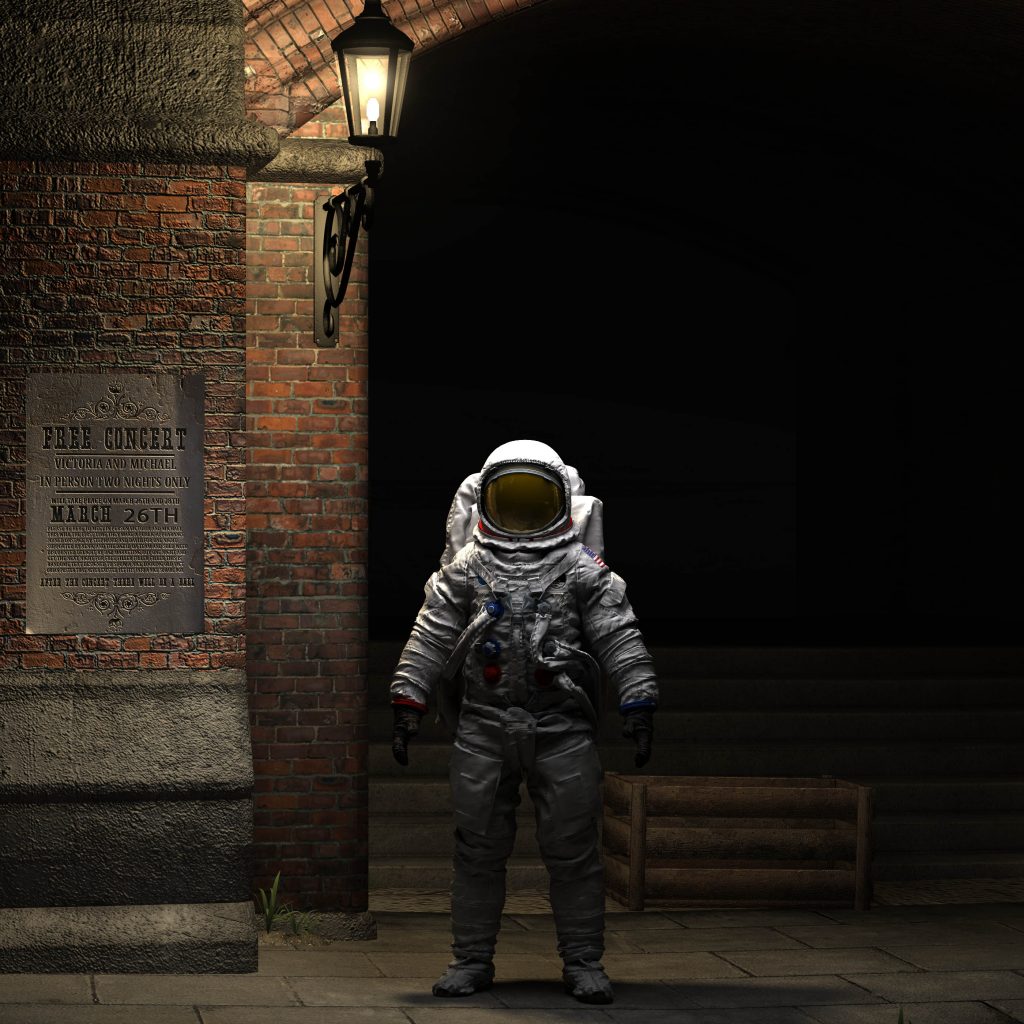
I did several versions of this, several of which I liked.The setting is “The Ministry” from Daz Studio, exported to Lightwave. Astronaut is by Albin on CGTrader.

This one was harder to make work, not so man angles I liked. Mercury astronaut in a Japanese style setting.

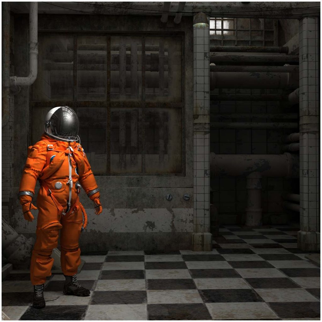
I also found very few angles I liked for this one showing a Russian style cosmonaut in a derelict tube station.

Chronologically this was the first one I tried – it uses the excellent setting from “Stonemason” on Daz, exported to Lightwave 3d. I came back and made some adjustments after working on others, to apply what I learned.

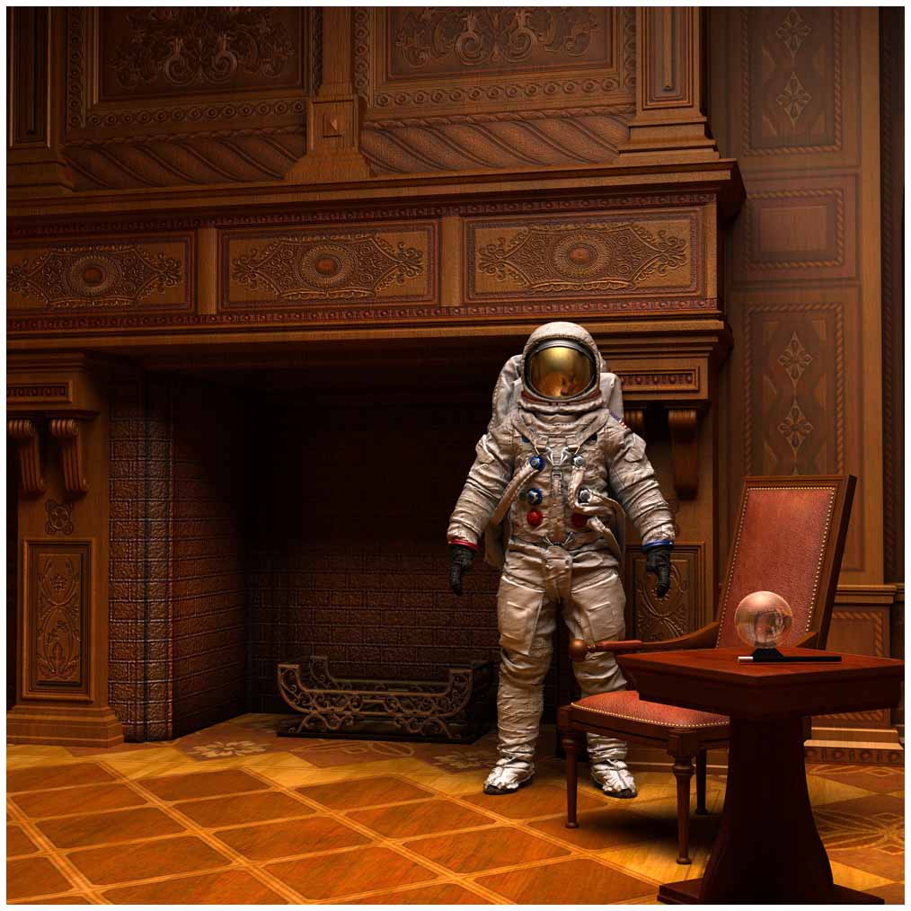
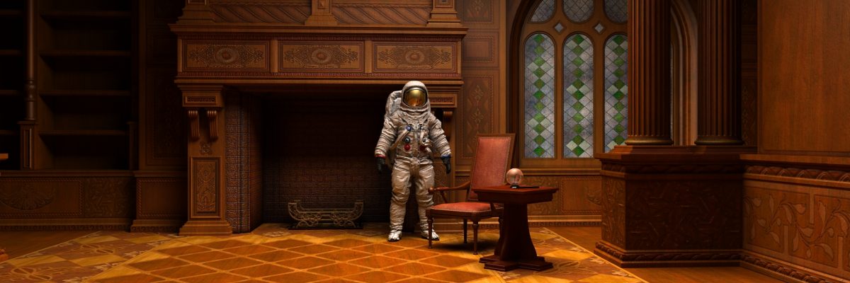
I saved the best till last! This is definitely my favourite, and shows an Apollo style astronaut in an old fashioned study.
I think several things help make this work – having the chair in front of the astronaut makes it look less like it might have been composited in. But I think the key element here is the way that the indirect lighting gives an orange cast to the white space suit. In my view this really embeds him in the setting.


Awesome graphics!!
Greetings Nick, I miss seeing your work on Foundation3D.
Your work and information is always top shelf.
~DELTA