The Rocket Library

In 2018 I was doing an international commute, and wanted something I could work on effectively while travelling. Eurostar is pretty comfortable, (particularly in standard premium), and the new laptop was seriously powerful, but I’ve never found it easy to work with a touch pad, and there wasn’t enough space for a mouse.

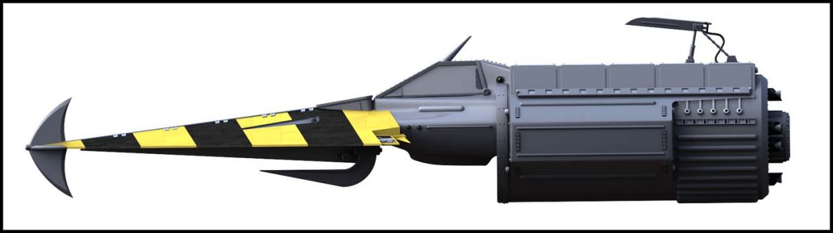
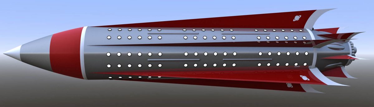
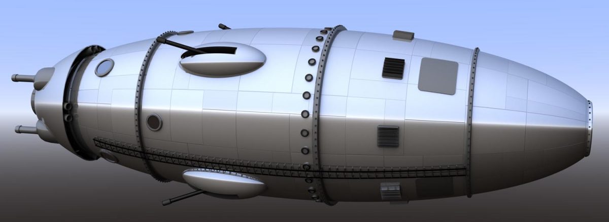
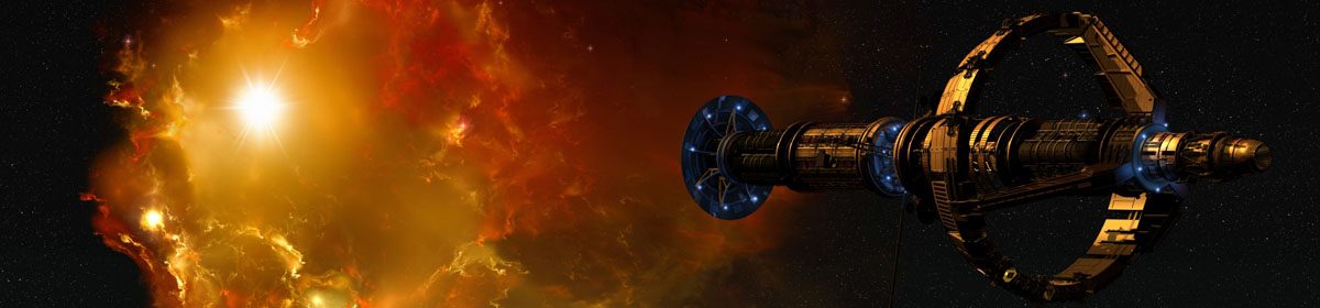
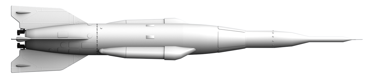
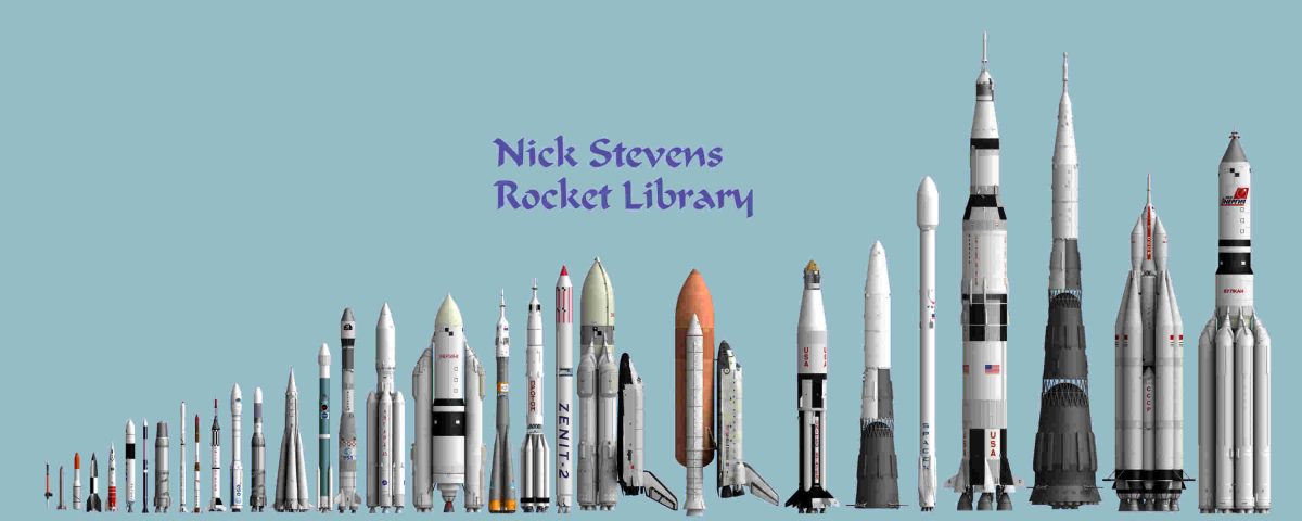
 So I came up with the idea of tidying up the various real spacecraft I have worked on, and assembling sets of images rendered perspective free, to a standard scale, which would make it easy to clearly show the different sizes of the various spacecraft.

This soon became the Rocket Library project!

A collection of most of the rockets I have modelled, all done to the same scale.

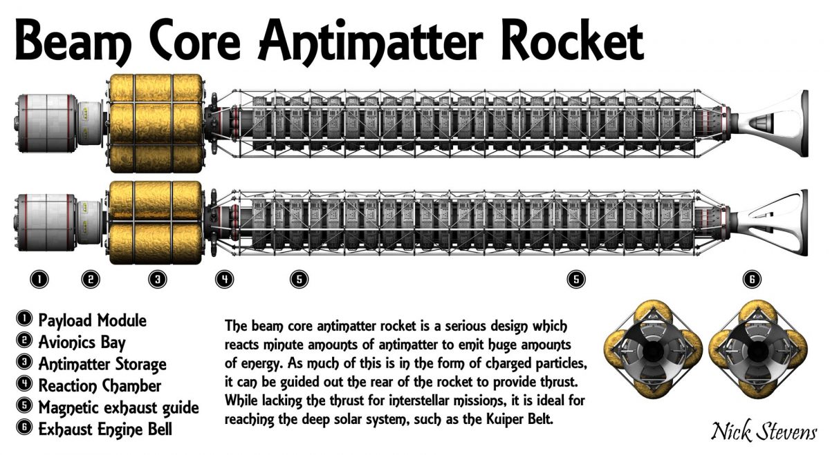
(Click for a larger version.) Continue reading “The Rocket Library”

An objective system for how realistic / credible a spacecraft is…

I sometimes get into discussions about if a spacecraft design is realistic. These are frequently interesting, but it’s not straightforward. For example, there are serious designs from the early days of spaceflight which we now know could not work. Manned craft without heavy radiation shielding are a common example of this.

On the other hand, you have some fictional craft carefully designed to be as realistic as possible – the vehicles in “2001 a Space Odyssey” are a great example.

So how to handle it when some fictional craft are more credible than serious designs? here’s my attempt at a system, from the most realistic to the least. Comments and additions are very welcome.

1. Real space hardware that actually flew successfully.

Clearly you can’t get more realistic than this!

Example: Saturn V rocket

Saturn V rocket
Saturn V rocket., perspective free views. Render by Nick Stevens

Continue reading “An objective system for how realistic / credible a spacecraft is…”

The Frank Tinsley “Lunar Unicycle”

I recently came across the Frank Tinsley illustration of what he called a “Lunar Unicycle”, which might be better described as a monowheel.

Lunar Unicycle Illustration

Despite the lack of many illustrations, the design seems clear, and I decided to do a 3d version of it in Lightwave. Though I did later find a couple more pictures… Continue reading “The Frank Tinsley “Lunar Unicycle””

The Slabship / Fury – Development and finished renders

An unusual one for me, as I take a crack at an original science-fiction design.

My objective was to  get something seriously large, primarily for use in Vue. My thinking is that I notice many great concept art pages have fairly abstract ships that are so big the more distant parts are afffected by haze, giving a great sense of scale. And as volumetric effects are a strength of Vue, I figure model in LW with Vue in mind. In practice this meant:

  • Keep the number of different surfaces low
  • Avoid clever effects that I don’t know how to do in Vue, including advanced surfaces
  • Avoid elements that would give a clear idea of scale, such as windows, hatches, stairs
  • Make it a long design so it’s easy to get the most distant parts lost in fog

Continue reading “The Slabship / Fury – Development and finished renders”

The Lightbulb Ship

This was based on an image I found, taken from the cover of the March 1961 episode of the Magazine of Fantasy and Science Fiction.

Magazine of F and SF, March 1961
Cover of Magazine of Fantasy and Science Fiction, March 1961

A really unusual shape, making the whole thing look like a cross between a lightbulb and a thermos flask. I suspect it’s meant to be nuclear , which makes standing around the engine area somewhat adventurous.

Continue reading “The Lightbulb Ship”

The Blitzspear – Nemesis the Warlock – 2000 AD

I was rummaging around my hard disk, and found this project, which I don’t seem to have blogged before…

After I finished Uni, I was a huge fan of 2000 AD comic, which was really hitting it’s stride. Many writers and artists went on to become the best, and best known in the industry, and 2000 AD was original, witty, and utterly wonderful.

There are not many vehicle concepts that really made a mark, but the one I remember best was the Blitzspear of Nemesis the Warlock.  An arrowhead, shaped like the characters head, it was menacing, and looked really fast! Here’s my CGI version.

Continue reading “The Blitzspear – Nemesis the Warlock – 2000 AD”

Classic space cruiser, finished renders

Right! The space cruiser is now done. I struggled a bit with the nose until I decided to make it a dome, and then added the spike, and the scallopped textures around it.

These renders are deliberately not done in a very realistic style. To be specific:

  • The environment reflected in the chrome is not in the scene
  • The lighting is very broad, not accurate for a smape scene.
  • Lighting directions may not match properly, I’ve gone for drama over realism.

Continue reading “Classic space cruiser, finished renders”

Classic 1930’s space cruiser

It occured to me that I really don’t remember ever seeing one of those really old pulp SF cover space cruisers done in a modern CGI style. You know, the ones that look like a cross between a Zepellin and an express steam train:

db_094_07_amazing_stories_1920

Continue reading “Classic 1930’s space cruiser”

Buck Rogers – The Original Rocket

I’ve just finished up “The Satellite”, the original 1930’s design for the Buck Rogers Rocket. References were a bit contradictory, so I would not be surprised if you find some that look a bit different.

Buck Rogers Reference Buck Rogers ReferenceHere are some of the more unusual features:

  • It’s a tractor rocket. By which I mean the rockets are at the front and it is pulled by them, rather than pushed.
  • It has four retro rocket tubes at the front.
  • It lands by balancing on it’s tail! Not very stable…
  • It had four weapons blisters with slots down the side.

Continue reading “Buck Rogers – The Original Rocket”

Out of the darkness, and into the light, final.

A collaboration with Ali Ries.

I was very interested when fellow IAAA member Ali Ries offered me the chance to use some of her glorious nebula backgrounds. I’m not very good at using strong colour, and this seemed like an excellent chance to get some practice in.

(You can see her work at Deviant Art).

I found a nice starship in the file libraries at Foundation 3D, and set about it.

I used a yellow distant light for the key light, matching the colour of the bright star. In exactly the same position I had a red dome light – dome lights are extended sources, (often a whole hemisphere), my idea was that the red light would produce a subtle warm edge to the shadow borders.

I experimented with a blue fill light, for added colour, but without a blue light source onscreen, it did not look right.

After experimenting with a warmer tone for the side light, I decided to go for some very small limited range point lights, acting like running lights on the ship. I struggled to choose between blue and red, but in the end I decided to do both!

Here are the results:

red-running-finalx

blue-running-lights-finalx

In case you are wondering, I got the title from a misremembered Hawkwind lyric – I liked the idea of a starship once again receiving the light of a Sun after an incredibly long journey.

As usual, all my bits were done in Lightwave 3d.