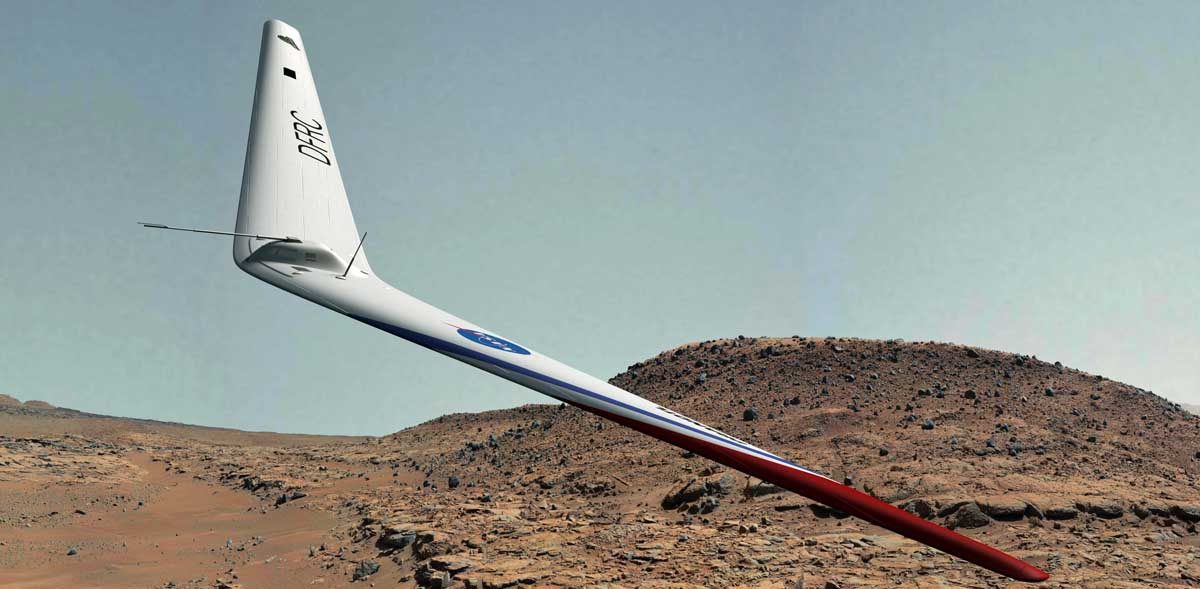
Some finished renders of the flying wing design. See previous posts for the work in progress, and sample reference images.
The sky was the most difficult part here. I was compositing onto panoramic photos, and had to make my own sky. I really liked the dark greyish green, but it’s not very realistic.
The actual colour of the real martian sky is complex – with blue sunsets, and so many photos being false colour. And that’s before you factor in how the human eye responds when one colour dominates.
This one is more realistic, but I’m less happy with the limited tonal range.
 So in the end I replaced the sky with something realstic in tone, but darker, so the flying wing stood out well against the sky.
 As usual, click on an image for a larger view.
This feels like one I will tweak in the future, coming back for more renders.
Nick


Nick,
Very nice work. Impressive!
Al Bowers
Thank You, glad you liked it…