I notice that people often post old Apollo era shots of Earth, unprocessed, in some cases reproduced from faded prints.
Well, haze in the atmosphere dulls down all shots from space, but it’s REALLY easy to fix. I’ll be using Photoshop elements, but you can do the same with pretty much any image editor, including the free open source GIMP. Similar options are available on tablets and phones.
The same techniques are a good start in restoring scans of old family photos.
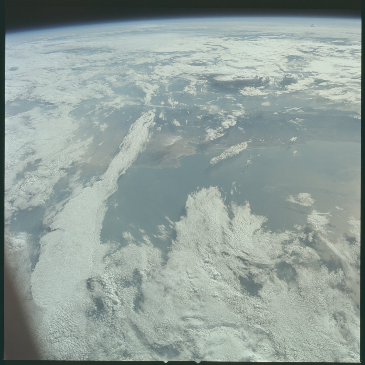
Here’s the original image.
Step 1, Levels
There are several simple steps, the first is to look at the LEVELS. This will show you a histogram displaying a scale from darkest to lightest, with the height on the chart showing how much of the image is at this brightness level.
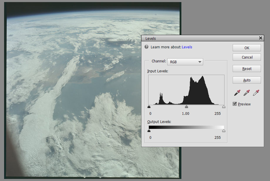
The bulk of the image is between about 45% brightness and 85% brightness. The dark hump towards the left is from the space at the top of the image.
By adjusting the triangles under the graph, we can effective stretch the colours in the most important regions of the photo to use the full range.
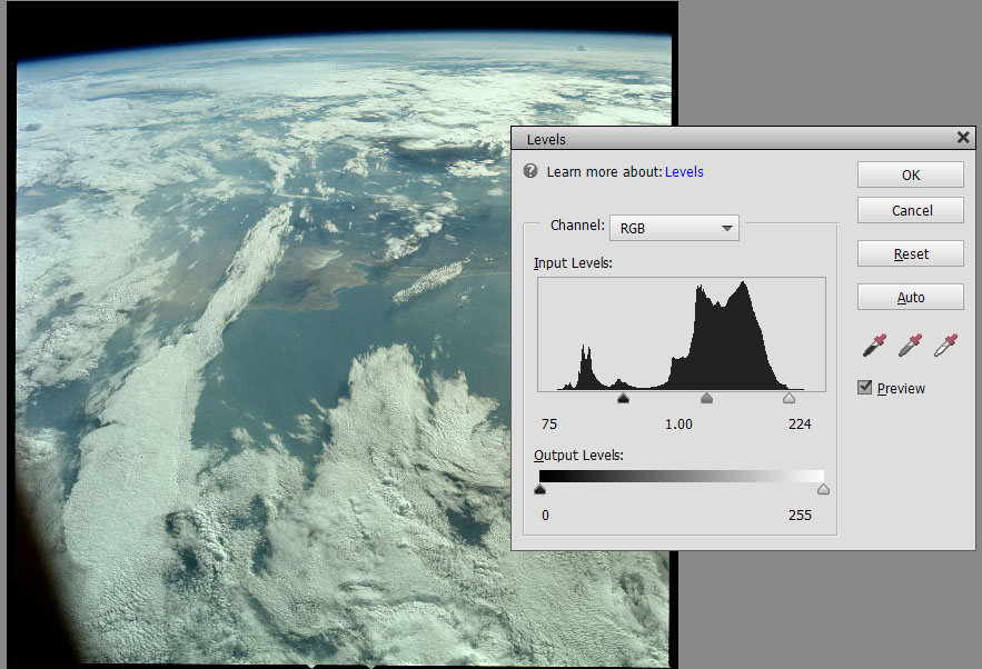
This is interactive, so you can safely experiment. Note that by moving in the end triangles, the contrast is a lot better. We already have a worthwhile improvement!
Step 2, Colour Cast
This is called different things in different software, sometimes it’s called white balance, but colour cast is the most common term. A colour cast is when the whole image is shifted towards one colour. For example, an old piece of paper is often called “yellowed” because it gets a yellow colour cast.
Looking at the image we have now, it’s not clear that there’s a strong colour cast, but the clouds look a bit tinted to me. To fix this you typically look for something that should be white or grey, uncoloured. For example a white shirt, or in this case the clouds.
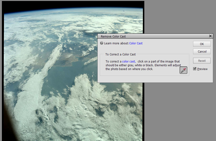
So, start up the colour cast / white balance tool, and pick something neutral to click on. You will probably need to try clicking in a few places to find a point that works well.
Here’s the result of my choice.

Fixing the colour cast
I hope you can see that this is another significant improvement.
Step 3, boosting the colour.
The final step is to give the colour a bit of a boost. Colour is often described as a mix of Red / Green / Blue, (RGB), but it can also be described by Hue (colour), Saturation, (Strength of colour), and Brightness. So grey is very low saturation, but an intense red is high saturation.
There are two main ways of adjusting this – you can increase the saturation, or some graphics software lets you do something a bit more subtle, called Vibrance. If your software supports it use Vibrance, but if not, adjust the saturation.
Now, be VERY careful not to overdo it. It’s very easy to push the saturation too far, and get a wildly unrealistic issues. But if you do it in moderation, maybe +10% or +15%, it can be very effective. Be particularly careful is the image already has areas of strong colour.

That’s it! You can see what’s going on as you experiment with the sliders, so it’s really easy to try out.
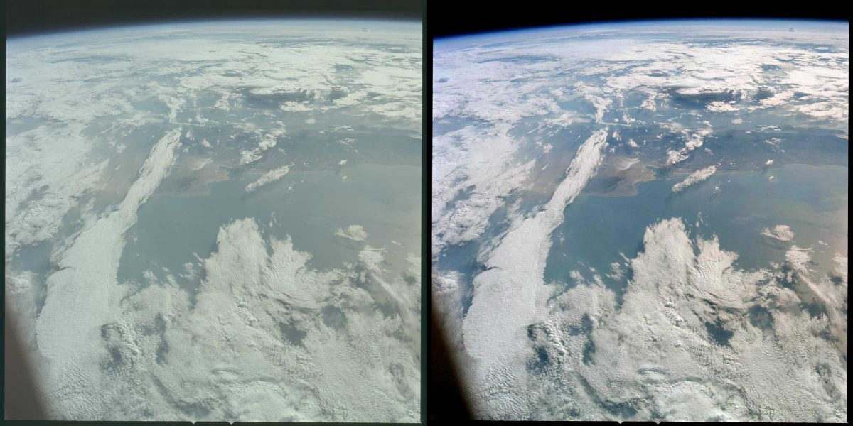
Here’s the original beside the final version. Not bad for a couple of minutes work, eh?

Footnote: Vibrance
Vibrance is a more subtle way of strengthening colour. Basically it does not change the intensity of very low, or very high saturation, but boosts the mid ranges. This works better on images that already have some areas of strong colour.
There’s a good article here if you want to learn more:
That’s all folks!