Tutorial – Making a CGI Ringed Planet

Level – Intermediate:

Introduction:

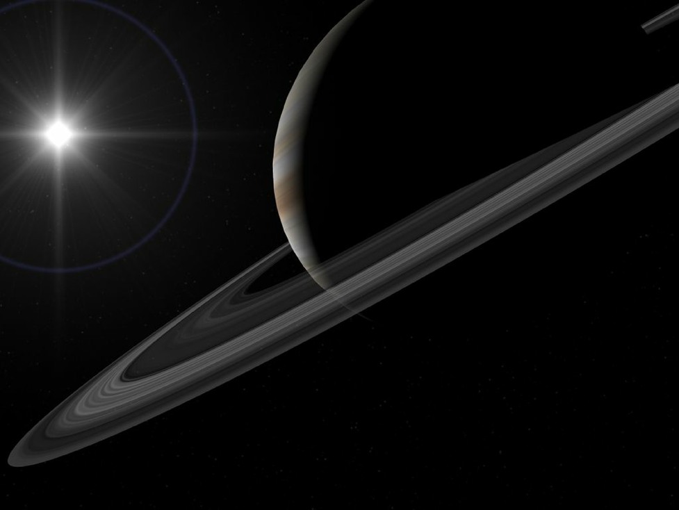
This is a fairly old tutorial, as you may notice by the version of Lightwave used! However, the principles are exactly the same in newer versions, and indeed you should be able to apply the ideas presented with pretty much any CGI software.

Original introduction

I have seen many rather poor attempts to make convincing ringed planets, and thought it might be a good idea to tell you how I do it. I rate it as intermediate in level, as I am not going to explain mouse click and numeric values. You should be familiar with making spheres and disks, and applying image based texture maps. I have done this tutorial as one long page, so it is easier for you to print. It should work with any version of Lightwave from 5.6 onward, and the ideas should also be easy to adapt to any other modern 3D graphics package.

The planet has 2 main components, the globe of the planet itself, and the ring system. Continue reading “Tutorial – Making a CGI Ringed Planet”

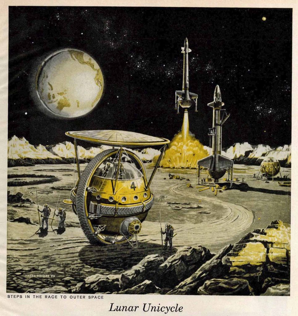
The Frank Tinsley “Lunar Unicycle”

I recently came across the Frank Tinsley illustration of what he called a “Lunar Unicycle”, which might be better described as a monowheel.

Lunar Unicycle Illustration

Despite the lack of many illustrations, the design seems clear, and I decided to do a 3d version of it in Lightwave. Though I did later find a couple more pictures… Continue reading “The Frank Tinsley “Lunar Unicycle””

Into the unknown, at the London Barbican. A review.

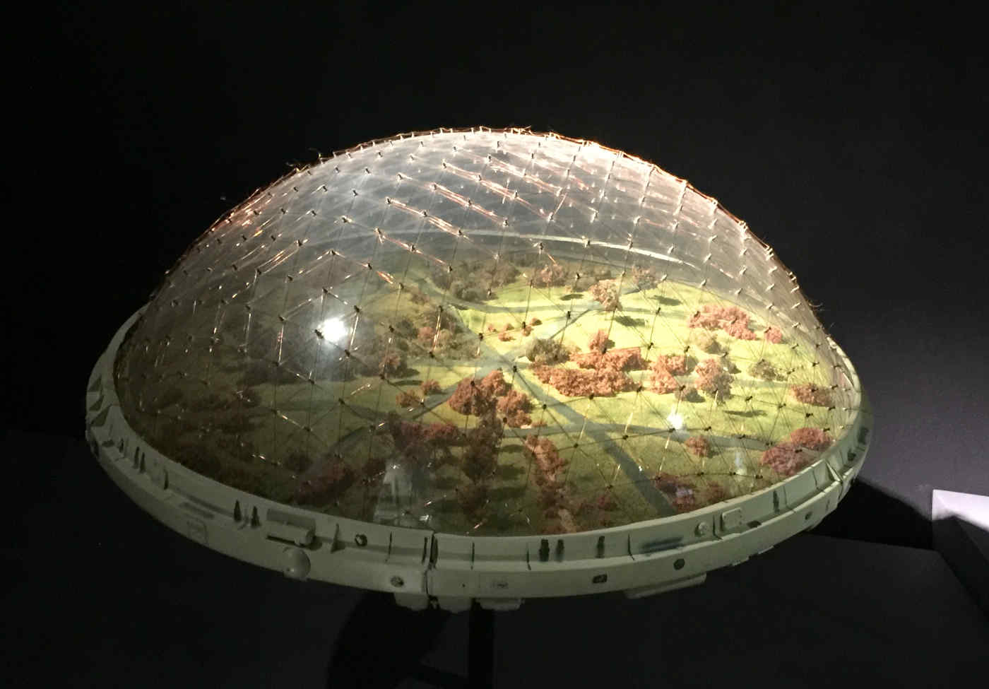
Yesterday I visited “Into the Unknown“, a Science Fiction exhibition which is currently on at the Barbican, London, and will tour later apparently. This is my review of what I saw there.

The space within the centre they have chosen to use is a bit odd, to say the least. They call it “The Curve”, and it’s not really good for this kind of thing. It’s fairly narow and tall, and feels cramped. Many of the exhibits are a long way up, making it difficult to see them properly.

A dome habitat from "Silent Running"
A dome habitat from “Silent Running”

Continue reading “Into the unknown, at the London Barbican. A review.”

More explorations in Vue – Using Haze and Fog, 3d planets

I’m continuing to spend most of my graphics time in Vue recently, and I think I am starting to feel comfortable with it. I’m still getting occasional frustrations, but I’m feeling a lot more in control.

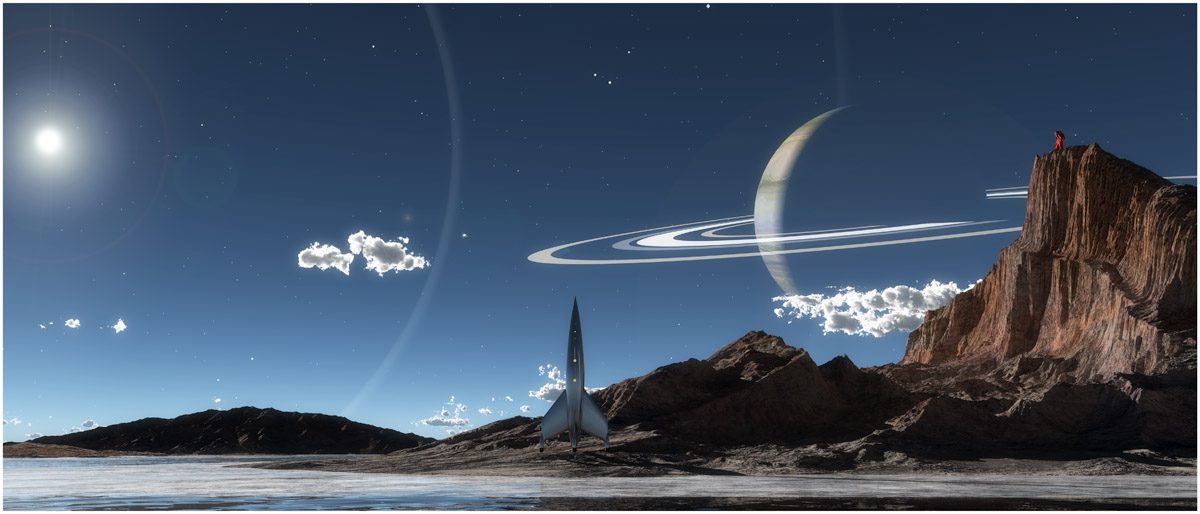
One lightbulb moment was when I realised I did NOT have to use the included billboard planet options for planets! But could use full 3d objects which then pick up the light from the Sun, and are properly affected by the haze and fog. A good example is the ringed planet in the banner image for this post, at the top. (Note the tiny astronaut at the top of the cliffs!)

And here’s another:

Alien cityscape with ringed planet

Continue reading “More explorations in Vue – Using Haze and Fog, 3d planets”

“It is sometimes an appropriate response to reality to go insane.”

I don’t use Daz Studio much these days, but thought people might be interested in one specific image I was very happy with, from a few years ago.

I don’t like the Daz renderer at all, as I find it ridiculously difficult to control the arrangement of things, and position them accurately. So I generally export them as OBJ, and then rework the textures. This last bit is not too painful, once you get used to what stuff typically needs fixing. However, there’s a ton of very reasonably priced content available for Daz Studio, and this draws me in.

I’m particularly impressed with the products of “Stonemason” (Stefan Morell), who consistently produces superb settings, often of a science fiction nature. Urban future streets, and SF interiors in particular. Continue reading ““It is sometimes an appropriate response to reality to go insane.””

The Lightbulb Ship

This was based on an image I found, taken from the cover of the March 1961 episode of the Magazine of Fantasy and Science Fiction.

Magazine of F and SF, March 1961
Cover of Magazine of Fantasy and Science Fiction, March 1961

A really unusual shape, making the whole thing look like a cross between a lightbulb and a thermos flask. I suspect it’s meant to be nuclear , which makes standing around the engine area somewhat adventurous.

Continue reading “The Lightbulb Ship”

Warming up with Vue again…

As those who follow me on Twitter @runnymonkey will have seen, I’m trying to get back into the swing of Eon’s Vue package, which specialises in atmospheres and landscapes.

Now I often have something of a love hate relationship with this program, as I find it a mix of the incredibly impressive, and the incredibly frustrating.

The Mars Fleet Assembles`
The Mars Fleet Assembles

(I’m currently on Vue 2014, and considering an upgrade if this goes well) Continue reading “Warming up with Vue again…”

Classic 1930’s space cruiser

It occured to me that I really don’t remember ever seeing one of those really old pulp SF cover space cruisers done in a modern CGI style. You know, the ones that look like a cross between a Zepellin and an express steam train:

db_094_07_amazing_stories_1920

Continue reading “Classic 1930’s space cruiser”

As Philip K Dick said…

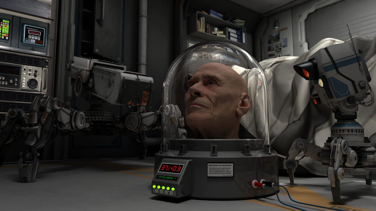
An older image, which I thought I would revive for this blog.

headcase-again

“It is sometimes an appropriate response to reality to go insane.”

Philip K Dick

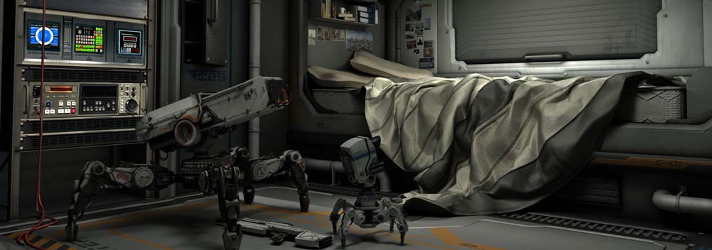
The setting and two bots are by StoneMason, and exported from Daz software. The head is by Ten-Twenty Four studios. Head case by me, as was the scene, lighting, and so forth, which was done in Lightwave 3d.

I often struggle with characters even in a basic way, and even more when I try and get some sense of story into an image. This is one of very few with a human figure I am happy with.

Finding a relevant quotation from PKD really was the icing on the cake, as I am a huge admirer of his work.

Nick

Out of the darkness, and into the light, final.

A collaboration with Ali Ries.

I was very interested when fellow IAAA member Ali Ries offered me the chance to use some of her glorious nebula backgrounds. I’m not very good at using strong colour, and this seemed like an excellent chance to get some practice in.

(You can see her work at Deviant Art).

I found a nice starship in the file libraries at Foundation 3D, and set about it.

I used a yellow distant light for the key light, matching the colour of the bright star. In exactly the same position I had a red dome light – dome lights are extended sources, (often a whole hemisphere), my idea was that the red light would produce a subtle warm edge to the shadow borders.

I experimented with a blue fill light, for added colour, but without a blue light source onscreen, it did not look right.

After experimenting with a warmer tone for the side light, I decided to go for some very small limited range point lights, acting like running lights on the ship. I struggled to choose between blue and red, but in the end I decided to do both!

Here are the results:

red-running-finalx

blue-running-lights-finalx

In case you are wondering, I got the title from a misremembered Hawkwind lyric – I liked the idea of a starship once again receiving the light of a Sun after an incredibly long journey.

As usual, all my bits were done in Lightwave 3d.